Red is the color of love. It’s the first color humans perceive after black and white. In certain cultures, it’s the color of power. It’s a primary color that, when combined with green and blue, makes white. Things can be red hot, in the red, or sometimes not worth a red cent. We can roll out the red carpet, catch somebody red-handed, or perhaps go out and paint the town red.
We may talk about red all the time, but we rarely see the color red used in kitchens or bathrooms. It can be such an aggressive color. Hard to live with. I’m sure we’ve all seen images of startling red rooms that feel very unwelcoming.
But wait! Sometimes the right red in the right place can make all the difference and really bring a room’s design to life. In my opinion one of the most “livable” shades of red is carnelian — a lovely mix of cool red with a warm undertone.
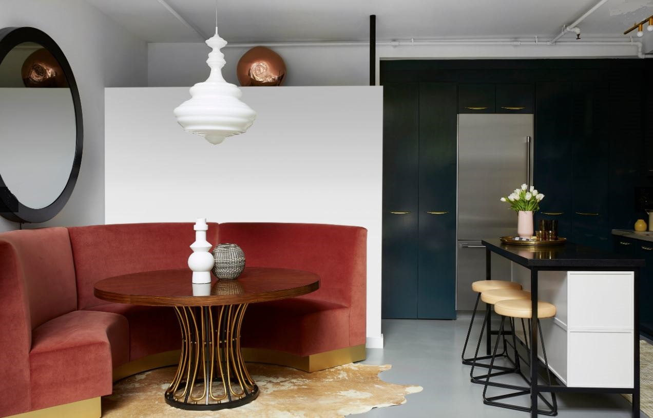
Here’s a splendid example of red done right. This beautiful banquette by Black Lacquer Designs upholstered in a soft, carnelian red velvet makes a stunning counterpoint to the dark kitchen cabinetry. The warm golds and yellows in the room enliven the red just that much more.

Carnelian Beads
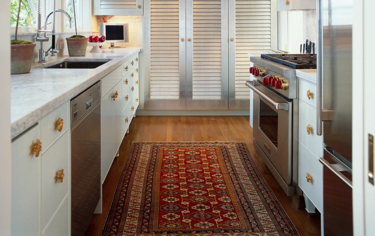
Deeper red tones in the carpet and at the Wolf range add warmth to a mostly white kitchen shown here in a photo by David Papazian. Note the designer’s thoughtful sprinkling of gold around the room — the cabinet handles and the bezels at the range knobs add just a touch of glamour. Gold is a perfect foil (pardon me!) for red as we see here and in the photo above. Also worth a second look is the silvery paint on the louvered pantry doors, also finished with gold handles. Well done!
A combination of warmer and cooler red elements show up in art and furnishings at this remodeled home I designed. We added space at both front and rear of the home resulting in this hallway. To offset any feeling that it was too long and narrow, I designed these non-structural beams into the plan to break the hallway visually into segments, then added more windows that open to the courtyard thsu widening the visual expanse while allowing in beautiful natural light. You’ll notice, too, we tucked in deep storage closets in the attic space above the rooms for holiday decorations.
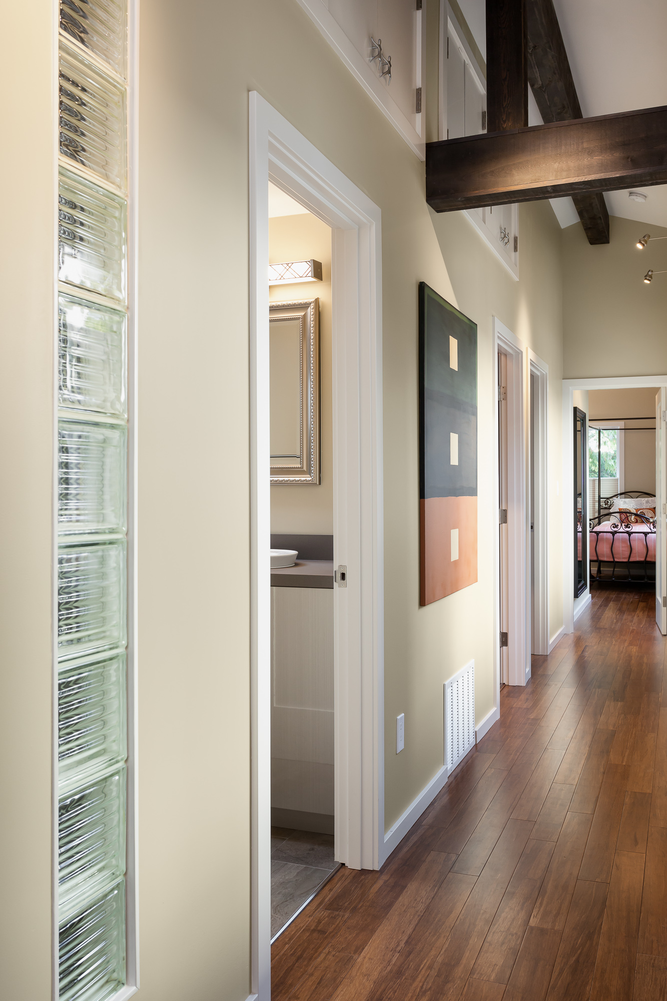
Photo by Julie Mannell
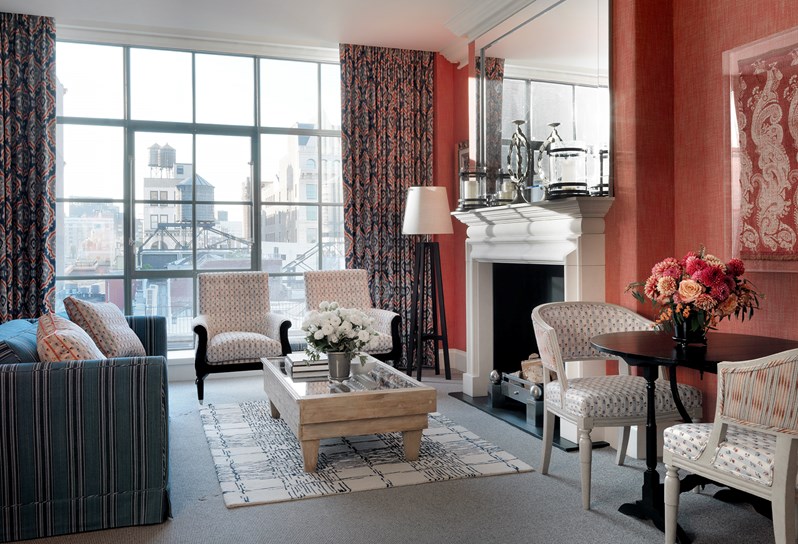
Kit Kemp, acclaimed British designer, and the co-owner and Creative Director of Firmdale Hotels, is known worldwide for her bold and brilliant use of color and craft. In this suite’s sitting room at the Crosby Street Hotel in Manhattan, she placed this lovely textural carnelian red wallpaper at the fireplace wall. It feels like such a warm counterpoint to the cool industrial feel of the buildings just outside the window. Notice the scale of the mirror — it’s the same width as the mantle, and completely fills the wallspace above it. This is a design detail we rarely see. I think this thoughtful design detail unifies the fireplace and mirror, creating another counterpoint, this time a monolith that echoes the shape and reflects the light of the window.
In the spa at the Ritz-Carlton Hotel in Macau, one experiences a wellness retreat swathed in dark timber, rich oak and sleek onyx. I would love to experience the visual richness of this ice fountain room, where the light glows in the deep red stones of the chandeliers while accentuating the perfectly book-matched veining in the dark onyx stone walls. Red is certainly the color of royalty in this part of the world, and its effect in this room is splendid.
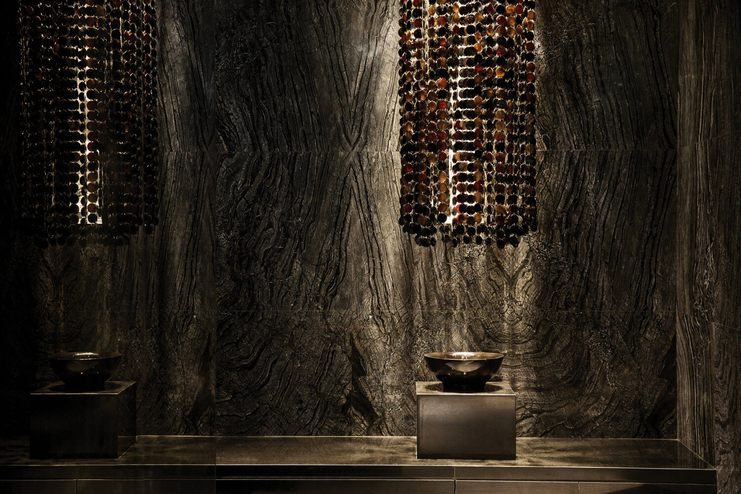
Photo by Marco Chow
